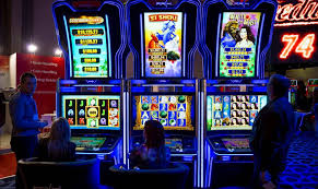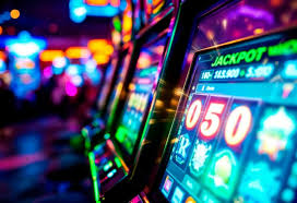
If you have ever walked into a space filled with slot machines, you may have noticed how your eyes seem to drift almost effortlessly from one glowing screen to another. It rarely feels forced. There is no loud instruction telling you where to look, yet something quietly pulls your attention again and again. That “something” is often color—bright, carefully chosen, and intentionally designed to guide your focus without you realizing it.
At first glance, it may seem simple. Just lights. Just decoration. But in reality, the use of color in slot machines is anything but random. It is a deliberate blend of psychology, design, and human behavior. Bright reds, glowing yellows, neon greens, and deep blues are not just there to look attractive—they are there to make you feel something. And that feeling, subtle as it may be, plays a powerful role in how long you stay, where you look, and what you choose to do next.
Studies in visual psychology show that the human brain processes visual stimuli in as little as 13 milliseconds, and color is one of the first elements it responds to. This means that before you even consciously think about a machine, your eyes and brain have already reacted to it.
How Colors Catch the Eye Before the Mind Thinks
The human eye is naturally drawn to brightness and contrast. When something stands out from its surroundings—whether through color, light, or motion—it immediately becomes a focal point. Slot machines use this principle with precision.
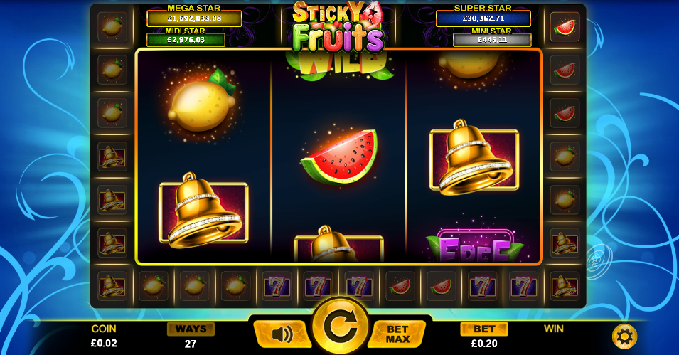
Bright colors like red and yellow are especially effective because they are highly visible and stimulating. Red is often associated with urgency and excitement, while yellow tends to signal energy and attention. When these colors are combined and enhanced with light, they create a visual signal that is almost impossible to ignore.
This reaction happens automatically.
You don’t decide to look—it just happens.
In fact, research suggests that high-contrast colors can increase visual attention by up to 80% compared to muted tones, especially in environments filled with competing stimuli. This is why slot machines rarely use dull or neutral colors. They are designed to stand out, even in a room already filled with lights.
There is also the element of movement. Flashing lights, shifting colors, and animated displays create the illusion of constant activity. Even when nothing significant is happening, the machine feels alive. This sense of “something happening” keeps the brain engaged, encouraging longer attention and interaction.
One casino visitor described it like this:
“Even when I wasn’t playing, I kept looking at the machines. It felt like something exciting was always just about to happen.”
That feeling is not accidental—it is carefully created.
The Emotional Influence of Color
Color does more than attract attention—it shapes emotion.
Different colors trigger different psychological responses. Warm colors like red, orange, and yellow tend to increase energy levels and create excitement. Cooler colors like blue and purple can produce a calming effect, making a person feel more relaxed and comfortable.
Slot machines often combine these colors in a balanced way. The result is an environment that feels both stimulating and comfortable at the same time. This balance is important. Too much stimulation can feel overwhelming, while too much calmness can feel boring. The right mix keeps a person engaged without pushing them away.
Research in environmental psychology shows that color-rich environments can influence mood and increase time spent in a space by up to 20–30%. This means that the colors themselves are not just decoration—they are part of the experience.
There is also a deeper layer to this emotional response. Bright colors often remind people of celebrations, games, and rewards. Think of festivals, arcades, or even childhood toys. These associations live quietly in memory, shaping how a person feels without needing to be consciously recognized.
A player once shared:
“The lights reminded me of arcade games I used to play as a kid. It just felt fun, even when I wasn’t winning.”
This sense of familiarity creates comfort. And comfort encourages staying.
When Bright Colors Create a Sense of Urgency
One of the more subtle effects of bright colors is the way they influence the perception of time and urgency.
Flashing lights and rapidly changing colors can create the impression that something important is happening right now. Even if nothing significant is occurring, the visual signals suggest immediacy. This can lead to a feeling that action should be taken quickly.
Psychological studies indicate that visual urgency cues—like flashing lights or rapid color changes—can increase reaction speed and reduce decision time. In simple terms, people act faster when they feel something is happening in the moment.
This does not mean people lose control. But it does mean that the environment encourages quicker decisions, often without the usual level of reflection.
A common observation from players is:
“It always felt like I had to act quickly, like I might miss something if I waited too long.”
That feeling of “missing out” is subtle, but powerful. And color plays a key role in creating it.
From Attraction to Habit
Over time, the influence of bright colors can move beyond simple attraction and become something more automatic.
The brain begins to associate these colors with certain experiences—excitement, possibility, reward. Each time a person sees similar lights, those associations are triggered again. This creates a pattern, where attention is guided almost instinctively.
Neuroscience research suggests that repeated exposure to visual-reward cues strengthens neural pathways, making responses faster and more automatic over time. In other words, the more often a person experiences these environments, the more natural their reactions become.
This is why returning players often feel drawn to certain machines without fully knowing why. It is not just preference—it is familiarity.
One regular visitor explained:
“I always end up at the same type of machines. I don’t even think about it—it just feels right.”
This “feels right” response is the result of repeated exposure and learned association.
A Gentle Awareness of Design
Understanding the role of bright colors does not take away their appeal. They are still visually engaging, still enjoyable, and still part of what makes these environments feel alive.
But awareness changes the experience.
When you recognize that your attention is being guided—not forced, but gently influenced—you gain a small amount of control back. You begin to notice what draws your eye, what holds your focus, and how your environment shapes your decisions.
This awareness is not about resisting or avoiding. It is about seeing clearly.
Because once you see how color works, the effect becomes softer. Not weaker, but more transparent.
A Soft Closing Thought
Bright colors carry a quiet power. They do not demand attention, yet they guide it. They do not force emotion, yet they shape it. In spaces filled with uncertainty, like gambling environments, they create a sense of energy, comfort, and possibility that feels natural and inviting.
But beneath that beauty is intention.
And perhaps the most important thing is not to step away from it, but to understand it—to notice how it makes you feel, how it draws you in, and how it quietly influences your choices.
Because when you begin to see clearly, even the brightest lights lose a little of their pull.
And in that clarity, you find something steady—something that allows you to experience the moment without being carried too far by it.